

RQA Indicator Spotlight: S&P 500
In this month’s economic data spotlight, we take a look at recent price trends in the most popular equity market index, the S&P 500, which contains roughly 500 of the largest (as measured by market capitalization) U.S. based companies. The index is updated on a quarterly basis and spans back to the 1920s.
Equity markets such as the S&P 500 are always pricing in or discounting current and expected information relating to individual constituent companies and the broader economic outlook. As such, if we think of the market as one big voting machine, it typically has a fairly good track record of looking 6-12 months ahead and pricing in positive and negative developments. Because the market acts as a wisdom of crowds measure, it’s often used as a decent forecast for what is going on in the real economy in the near and medium term.
The chart below details the S&P 500 price over the last 50 years. The bottom chart simply calculates the 1-year percentage change of the index. We can note the annual change in the index value is largely positive most of the time (stocks go up over time) with occasional and fairly deep declines every 5-10 years. These declines are generally related to expansion and contraction in economic growth, which ebbs and flows with the natural shifts occurring within the broader business cycle.
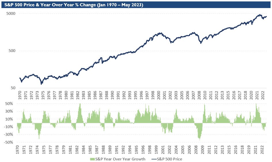
Source: Analysis by RQA. Data from Norgate Premium Data.
To utilize the S&P 500 index as an economic indicator, we plot the 1-year change in the index value and compare it to the economic growth model (see detail on the RQA Economic Growth Model). The following chart shows this comparison over the same 50 year time period.
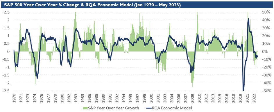
Source: Analysis by RQA. Data from Norgate Premium Data.
As we can see, large growth shocks to both the upside and downside are largely captured by the S&P 500 index 1-year change. This pattern can be seen when large positive or negative shifts in the economic model (dark blue line) are coincided by shifts in the year-over-year index growth measure (green bars). There is a lead-lag affect between the two data sets where the economic model leads and the index lags (and vice versa) at various times. There are also times where the economic model is counter to what the index data suggests. We find measuring and understanding these discrepancies beneficial when managing portfolio allocations and overall risk management.
As we narrow in on the more recent data , the economic model has been pulled moderately lower, suggesting potential contraction within the economy, while the S&P 500 index year-over-year change has had a few months of positive measures. This type of divergence isn’t necessarily uncommon, but it’s something to take note of. The market is attempting to look through near-term economic softness in the hopes of finding growth around the corner, and is therefore shaking off or discounting the economic red flags. From a historical viewpoint, the market has sometimes gotten this right but also has a tendency to get ahead of itself prior to a more sustained slow down in the business cycle. All in all, the S&P 500 shifting positive on a year-over-year basis is generally a positive development. However, we will want to see the economic model bounce back into positive territory for conformation.
Economic Forecast Model
The RQA Economic Forecast Model remained little changed for the month of June measured at -0.32 (vs. May reading of -0.34). A reading above the 0 bond would help alleviate the softness within the forecast model.

Source: Analysis by RQA. Data from U.S. Federal Reserve; Bureau of Labor Statistics; Norgate Premium Data; Institute for Supply Management
The RQA Economic Forecast Model represents a consolidated composite of key economic leading indicators and market-based explanatory variables. The goal of this composite model is to present a holistic measure of primary U.S. economic growth drivers and their trends over time. (Additional detail on the model’s construction is provided here.)
Values above the zero-line are indicative of positive U.S. economic growth expectations in the near-term, and therefore, indicate economic strength and lesser chance of recessionary pressure. On the other hand, values below the zero-line represent the opposite - a more negative outlook and more elevated probabilities of the U.S. experiencing an economic contraction.
TAKING A CLOSER LOOK AT THE ECONOMIC DRIVERS
In the economic heatmap below, we are able to peak under the hood at a wide mix of underlying growth drivers in the U.S. economy. By reviewing this underlying data in more detail, we are better able to see how the underlying components of the U.S. economic growth picture are behaving through time. The indicators presented below have each proven to have predictive qualities in estimating the future direction of U.S. economic growth.

Source: Analysis by RQA. Data from U.S. Federal Reserve; Bureau of Labor Statistics; Norgate Premium Data; Institute for Supply Management
In reviewing the data reported through May, we continue to note the following:
Various U.S. labor data points remain in moderately positive year-over-year trends. Initial unemployment claims came in elevated last week, which may suggests overall labor figures could be softening;
U.S. commercial output figures showed an uptick from month-over-month levels, but remain at fairly depressed levels from a year-over-year perspective. Service PMI increased versus last month, while the measure for industrial production declined, painting a bit of a mixed picture;
Trends in income and consumption figures have softened over the last four months with consumer spending now showing a year-over-year contraction; and
Financial market readings are showing a few signs of rebound with the aforementioned S&P 500 year-over-year return turning positive. The measure of consumer sentiment has also rebounded to positive territory versus a year ago as the market rally has helped turn around the negative sentiment held toward the end of 2022. Yield curves remain significantly inverted.
MARKET REGIME DISCUSSION
As inflation moderates, the market has looked to the Federal Reserve (Fed) for insight into when there will be a pause in interest rate hikes. As expected, the Fed kept the key interest rate level flat during the June meeting, which the market had largely priced in. As we touched on last month, Fed Talk came in quite hawkish with the Fed Chair, Jerome Powell, suggesting there may be two additional rate hikes on the near-term horizon (per the Fed’s “Dot Plot”). At the end of the day, the Fed is cognizant of the wealth effects a rising equity market can have on inflationary pressures across the economy and therefore want to continue with a more hawkish stance until inflationary metrics are back down to more targeted levels.
Per the Indicator Spotlight, the broader market, as measured by the S&P 500, has climbed the wall of worry, shaking off recent poor economic data and shocks within the banking sector. As the rally continues, one area to keep an eye on is the overall breadth of the current market rally which measures the number of individual stocks contributing to the overall return of the S&P 500 index. Focusing on the year-to-date return of the S&P 500 through May, 90% of the index return came from just 10 technology stocks (Forbes). While it’s intuitive, large companies that are innovating at a fast pace lead the overall index, concentration within the index and its return profile has historically suggested an unhealthy backdrop. Moving forward, participation across the broader market and sectors will be a welcome sign to confirm the index gains aren’t just attributed to a speculative rise in a handful of individual companies.
Source: RQA.